Sanoma
Building an easy access to a treasure trove of content
About
We partnered with Sanoma to make sure nothing would get in the way of the consumers’ effortless access to world-class content. Together, we set out to create audio app Supla and TV content app Ruutu.
Approach
Towards scalability and beautiful UX
When we started our work, Sanoma already had a viable concept for Ruutu, and applications for Android, Windows phone and iOS. However, the user experience in these apps was not optimal. Supla, on the other hand, started with a desire to build a beautiful MVP but quickly turned into a high-value project raising a lot of expectations. The end goal for both apps was clear: to make the two content treasure chests equally effortless to use, and easily scalable across different platforms.
A hybrid team, a seamless experience
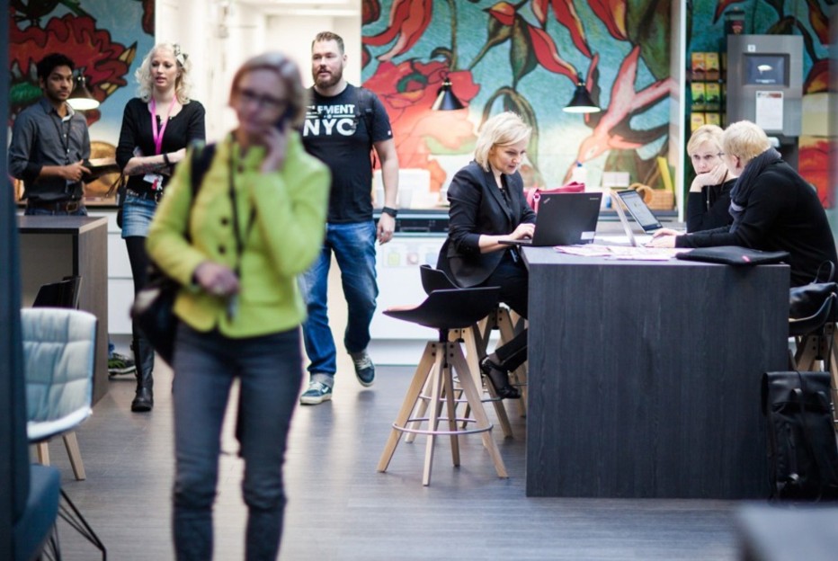
Our multi-professional team consisted of a designer, developers and platform specialists, and we collaborated closely with the Sanoma’s highly competent in-house development team. Seamlessness was the word, as the end solutions needed to function flawlessly and give an elegant user experience across different platforms, devices and operating systems. With this in mind, we drew inspiration from Google’s Material design framework
Solution
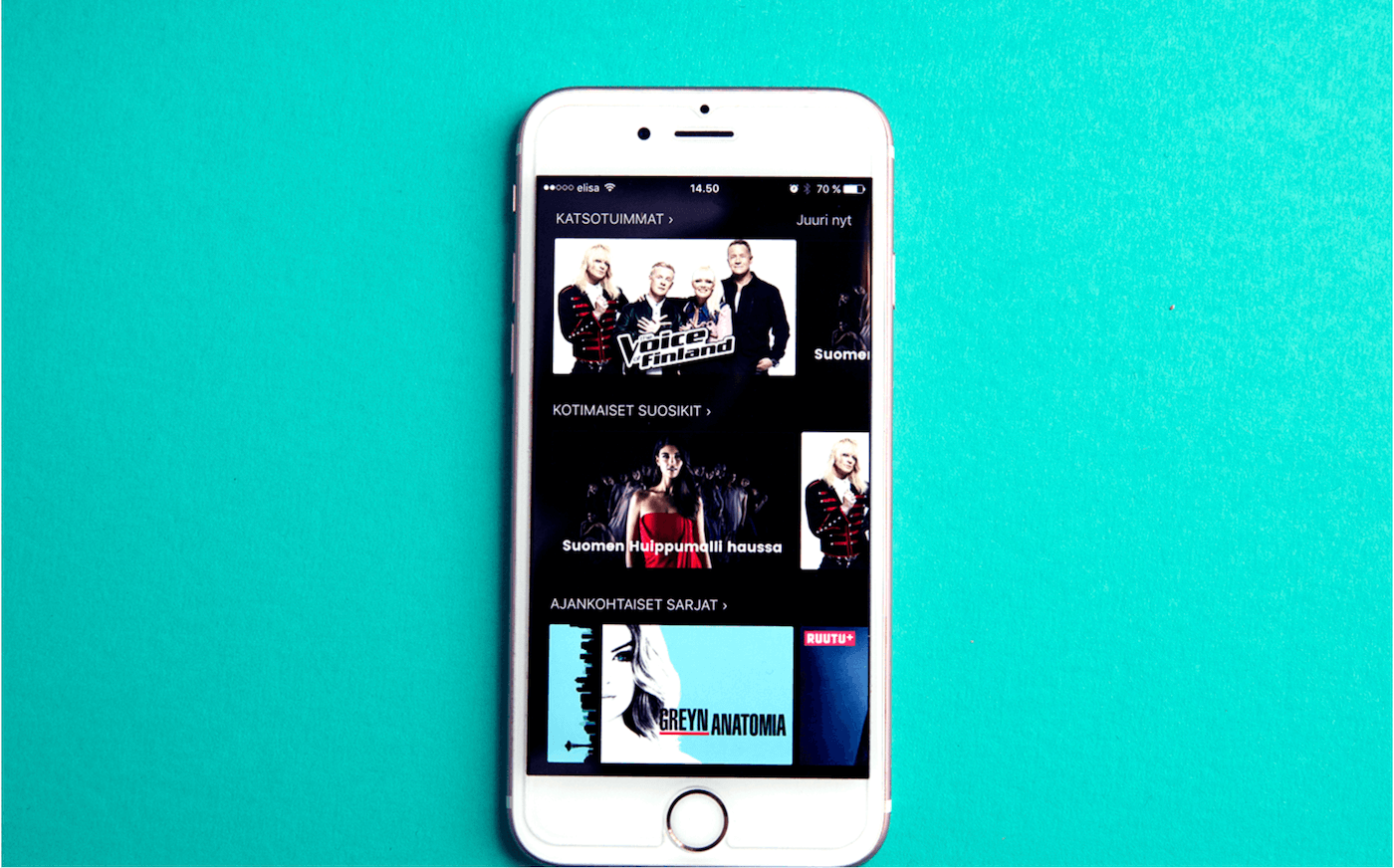
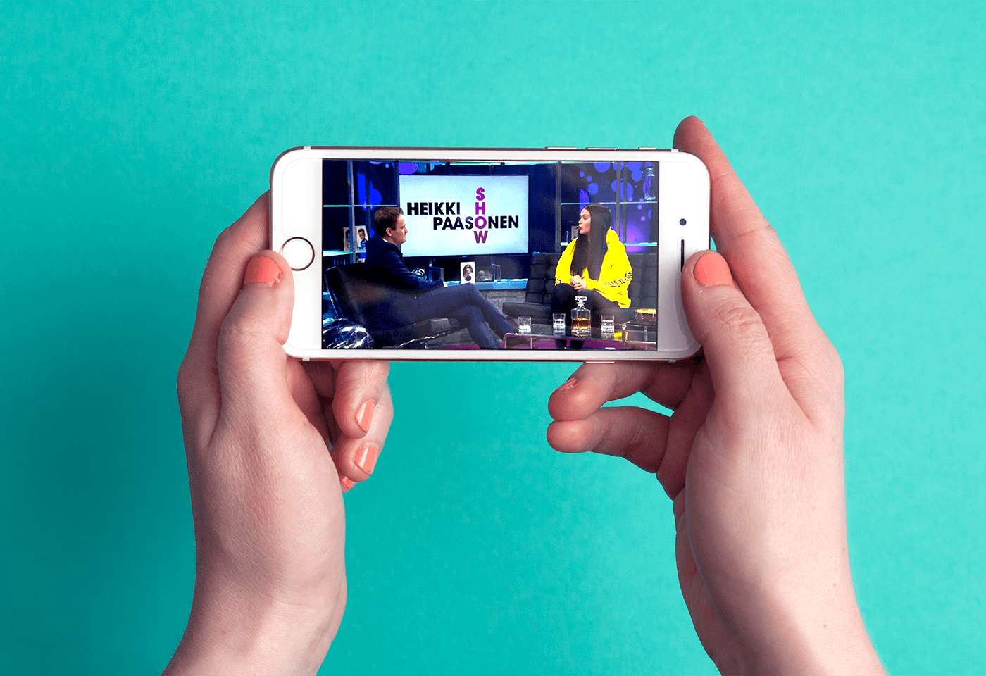
Neutral design
As a consumer, you want your favorite programs and shows to be easily at hand and ready to watch or listen with just a couple of clicks. One could think of the Supla and Ruutu apps as vehicles for achieving this. Therefore, we aimed to keep their brands in a subtle role, and the look & feel of the apps stylishly neutral. In the design, we wanted to make enough way for the most beloved of kings – the actual content.
Content management made easy
While it was key to design a beautiful UX for the end consumers, it was equally important to make content management as easy as possible. Reactive programming was a way for us to keep the setup in these interaction-heavy apps separate from front-end content management. Now, Sanoma’s editorial staff can freely update, change or reorganize content in Supla and Ruutu, while the apps themselves are still running smoothly.